Brand Refresh
Client: Internal & External clients (Beacon Health Options). Duties: Standardize and reinvigorate the Beacon brand.
Starting point
Before approaching this brand refresh, it was important to take a look at what was working and what wasn’t.
Overall the branding was strong—but lacked consistency, white space, and a scalable design system. The first step was to take a good hard look at all the branded materials produced over the years, both internal and external-facing. Once everything was viewed together, it became easy to understand what design changes would be needed. But first brand guidelines would be needed to address these concerns.
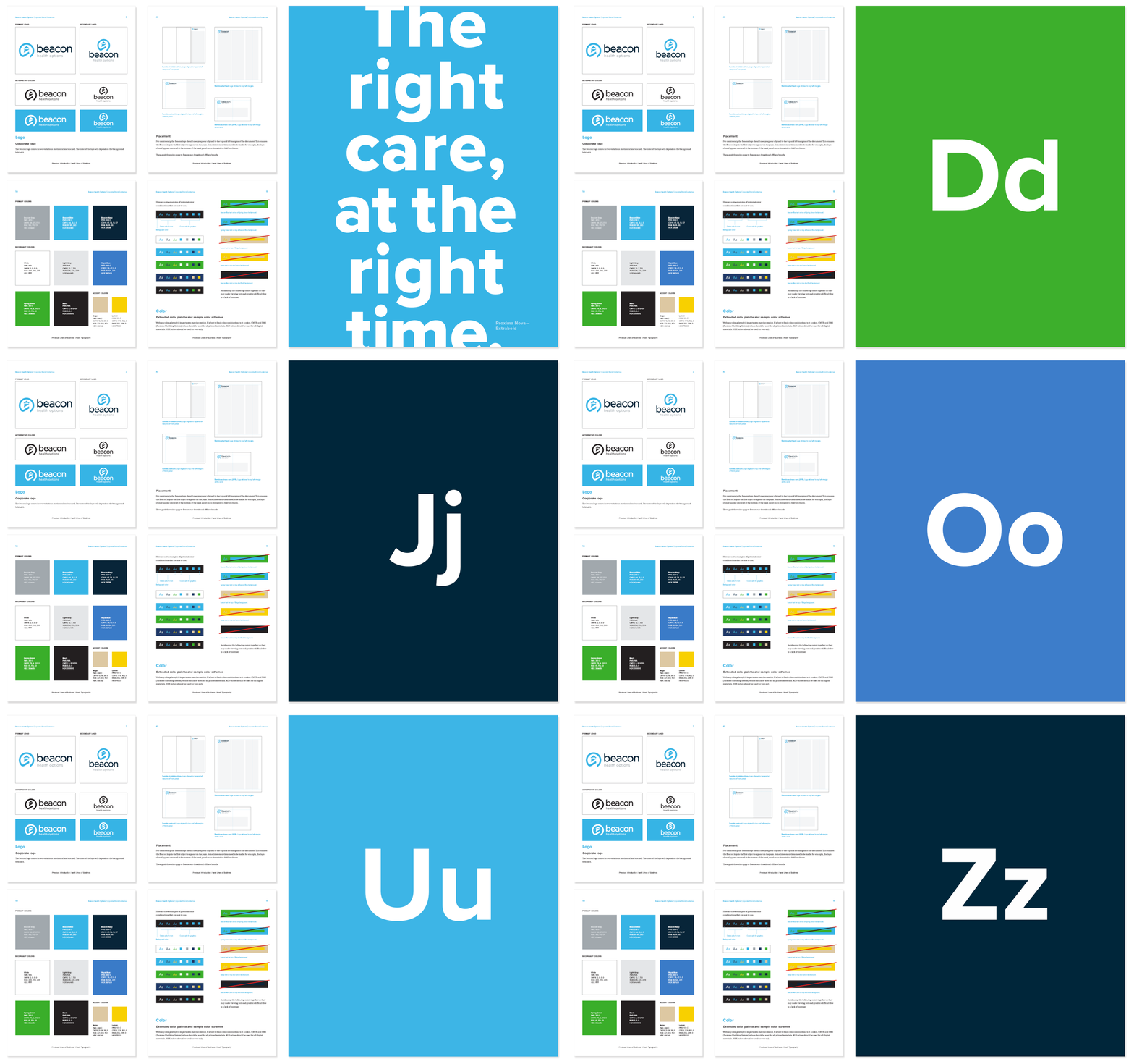
Creating guidelines
The goal of the Brand Guidelines was to get everyone to the same starting point. This meant standardizing elements such logo use, logo placement and size, colors, and typography to name a few.

Photography
The photo library was completely overhauled to reflect the wide diversity of our members. Special attention was also made to ensure subjects appeared in natural or non-posed environments.

Icon system
Each icon was built on a 1x1 pixel grid to maintain a consistent look and feel. Icons are available in Black or Beacon Blue.
Final design
The final design pulls everything together to create a system that is consistent, scan-able, and easy to scale.


